Monday, April 21, 2014

And what we made was glorious

So I have a little bit of a back story for today's layout. A few months ago my husband thought it would be fun to google our son's name- just to see what came up (as you do, right?! lol).  He ended up finding several images of a cute toddler boy with strawberry blonde hair. We thought it was interesting because our son has strawberry blonde hair (despite both of us being dark! We still get a kick out of that!) and it looked like this little boy could be *our* Henry in a few years. The photos came from a blog called Hey Natalie Jean and we thought it was cute that she called her Henry 'Huck" as a nickname, since we are still looking for a good nickname for our Henry. We're not big fans of Hank. Then a couple weeks later we were at our pediatrician's office for a well check, and one of the nurses mentioned the blog to us again- she was a fan of the blog and recognized our Henry's name and thought for a moment it could be the same one! So I decided to check out the blog a bit more and it turns out I have quite a bit in common with this gal. As I was reading a post about the birth of her son she ended it by saying "And what we made was glorious". I thought that was such a beautiful sentiment I just had to steal it for a layout title. I used one of the first photos of Henry after he was born and I really just LOVE this layout.
The paper is from a  new DCWV stack called Honey Chic. I am really loving the new lines they are coming out with, and you will too. They are really listening to their customers (sending lots of surveys to find what people really want from them, and then trying to accomodate) and also having some very on-trend offerings as well. They have some really great new stacks with nautical themes, blue and coral, outdoors, woodsy and vintage. And you will die for the Gilded stack. Kraft with gold.  Foil. It is AWESOME. I will have to post a card I made for my husband with this stack. It was great for a man card because it wasn't too feminine. But anyway, back to my current project!
Lots of fun colors, and I really like the bright colors against the black. I popped up the flags so they would really pop off the page.
I can't even tell you how I am still so excited to be able to design titles like this with my Cricut Explore! It just makes me giddy! So I took one of the 4x6 journaling cards from the stack. It had a cute glitter-y (it's hard to see in the picture) banner element which I thought mirrored well off of the banner I had on my page. I designed the title, and because of the software I was able to adjust where it would cut on the mat so I could cut the title on the journaling card and then back it with patterned paper. I really love how it turned out. I just added some colorful sequins confetti style to fill in the white space a little bit.
The blue paper in the background has a bunch of sweet phrases in a script font. I highlighted one that said "you make me happy" because I thought it was so fitting for this page. The camera is an SVG cut that I was able to cut with my Cricut (!). I believe I got it from 2 Peas. I still love camera images and use them frequently. The darling 'This" paperclip and flair are from Freckled Fawn. They have the best embellishments. Love them.
Lastly I just added some colorful enamel dots and arrows to add just a little more color and interest in the upper left corner.

I hope you enjoyed my project today. Here is a picture of the stack I used if you would like one of your own!!


Sunday, April 20, 2014

<a href="http://www.bloglovin.com/blog/3549789/?claim=t23v79nbdu6">Follow my blog with Bloglovin</a>

Saturday, April 19, 2014

All Bundled Up for True Xoxo Scrapbooking

Hi all! I was honored to be selected as a guest Designer over at True XoXo Scrapbooking this month. If you haven't checked out this blog, you definitely should. Every month they have a new challenge that involves scraplifting the work of a Design Team member. I think this is a really fun idea because for one, it is different than the usual sketch or theme challenges. For two, there are so many ways you can scraplift someone's work- you can take their project and use it as a sketch, or get inspired from a design element or color scheme. Or even just go off the subject matter of the original layout. There are so many possibilities and it is such a unique way to get inspired. Here is my layout: (Sorry again for the weird shadows and color casts on the photos, I'm going to have to work on that!)
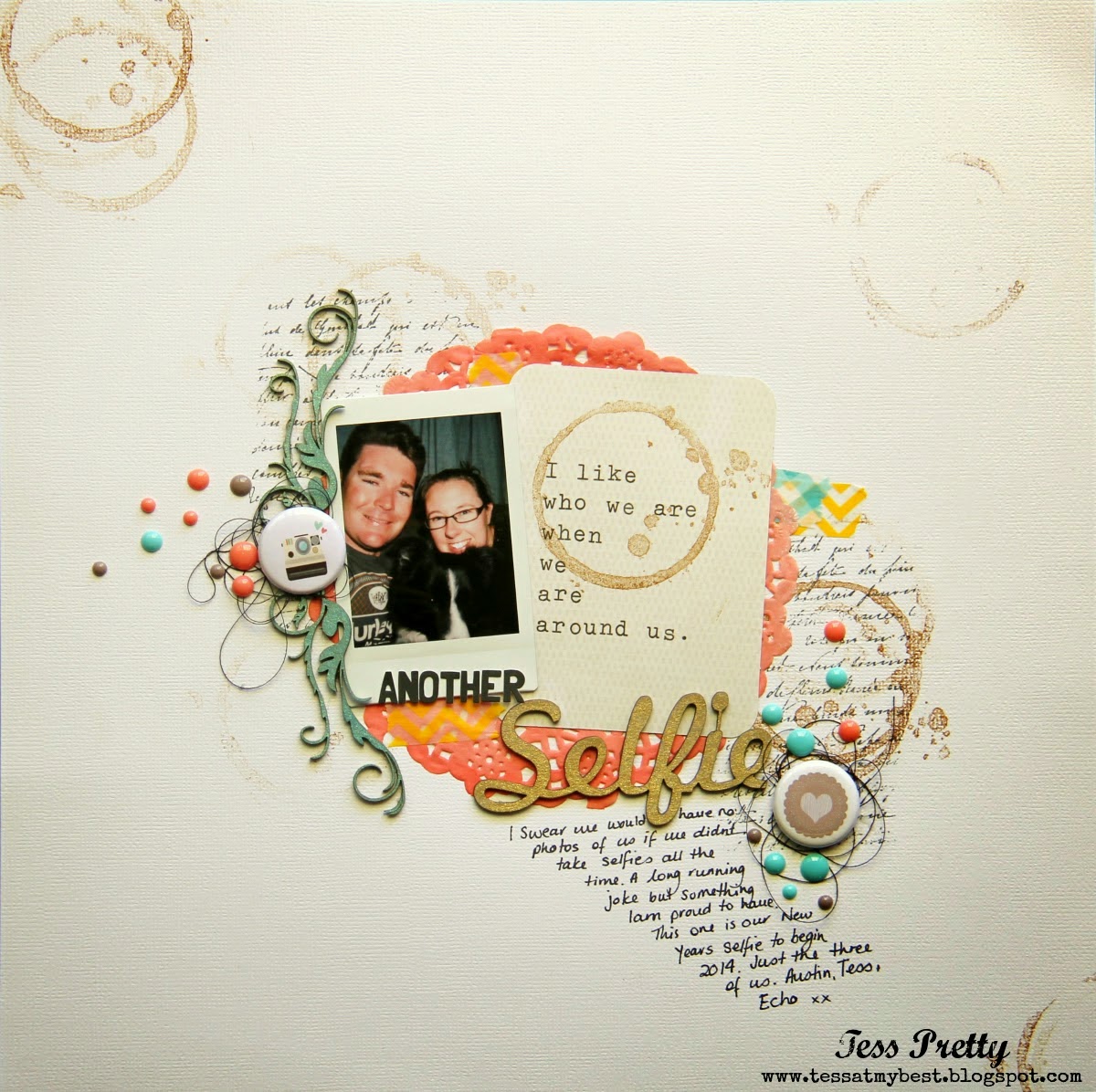
And here is the page from the talented Tess that I scraplifted:
I really love her layout and used many elements for inspiration. For one, the basic design. I used her page as a sketch, and just upsized it a bit. I journaled directly on my background paper as she did. I tried to place some of my elements where she had her coffee ring inking and I also used some enamel elements as embellishments like she did with the enamel dots.
I usually have rather large titles on my pages, so I thought it would be fun to downsize it for a change, using the letter stickers that came in the paper pack I was using- Keepin' Cozy by Echo Park. Those itsy bitsy tiny little minuscule pearl elements are from Doodlebug and I just love them. They are so tiny and cute!! The enamel arrows are from them as well.
I layered some cute washi in the upper left corner with some snowflake stickers from the kit. I also used a snowflake shape as a background element (where Tess used a cute doily) as my page had to do with bundling up from the cold.
Here I used a snowflake border (where Tess used a pretty flourish) to frame my photo and then added a cute little Nordic deer sticker.

I had a lot of fun with this challenge, and it looks like I will be joining them next month as well! They have a really talented design team and I am always inspired by their work, so I hope you will stop by and give it a try! It's a fun way to get those creative juices flowing, AND you could be picked to be a guest designer for them!!


Thursday, April 17, 2014

Mommy's Little Monster

I am really loving fun, bright colors right now. Especially for my baby boy pages. Echo Park has some great boy lines with these fun brights. I used one of their lines for this cute monster layout. I apologize in advance for the weird shadows in most of these photos. :/
We got a few shots of Henry in this adorable monster hat that his cousin made for him, so I thought a monster themed page would be so fun. Plus those little monster die cuts are just too stinkin' cute, especially for boy pages. I got to work out my new Cricut Explore quite a bit with this page, and it was a blast!
For starters I cut out a big gear shape to layer on the back of the page. I thought it was more fitting than just a circle shape. Then I picked out a cute monster and cut all the layers. I popped some of the layers up for dimension.
I thought it would be nice to use some honeycomb shapes to mirror the honeycomb border sticker I had used. Plus, I got a new honeycomb punch so I thought I would give it a workout. I haven't used a lot of punches in the past because I knew I could always cut the shape with my Cricut, and save the money on the punch. However, for some of the basic shapes that I use a lot those punches are just so much more darn convenient! I shoulda seen that long ago! I popped up every other hexagon and added some cute star stickers.
I used three different fun fonts for my title. I believe the 'Mommy's' and 'little' were fonts that I downloaded on my laptop, and the 'monster' is from the Dinosaur cartridge. I thought it worked very well for a monster page as well!
And lastly, how cute is this 'RAWR'?? I knew I wanted to put a speech bubble with 'RAWR' since it looks like he is *actually* saying 'RAWR' in his photo! Then I found this ready made one and it couldn't have been more perfect for my page! 

I hope you enjoyed my project, thanks for stopping by today!!

Tuesday, April 15, 2014

Eat Sleep Cry

Hi folks! Got another baby layout to share with you guys. The title of this layout is Eat. Sleep. Cry. Repeat. Whenever anyone sees it they say, 'you forgot poop!' Actually, I am well aware that the phrase is normally Eat, Sleep, Poop. However, in the case of my baby Eat Sleep Cry is more befitting. His poop was pretty minimal compared to the fussy crying, lol. So I thought it would be fun to capture some photos of him doing the three things that he does best:
LOL! I still laugh when I look at these pictures. This may not be your 'conventional' baby page, but they capture Henry at age 1-8 weeks.
The paper I used for this layout is from Maggie Holmes for American Crafts, but then I mixed it up with the embellishments a bit. I am in love with these sequined bows from Freckled fawn. I must get more STAT. And the little vellum envelope is from DCWV. I actually wrote my journaling on a little tag and placed it in there- just for fun! The twine is from American Crafts and the fun sequins are from Doodlebug! And aren't those itty bitty tags just the cutest? Those are also from DCWV- I'm in love!
I love the confetti look, so I took a fun mix of different size and shape sequins and glued 'em down. I am also having a lot of fun with the Dear Lizzy triangle punch! Hope you enjoyed my layout, and thanks for stopping by!!

Monday, April 14, 2014

This is my happy

Hi all! I've got a new layout to share with you today- this is one of my all time favorites. Sometimes everything just syncs up and you make something you can really be proud of. I decided to take a little break from scrapbooking Henry (I already have a full album and he's only 12 weeks old! By the time he's grown he'll need a storage unit for his scrapbooks!!) So I decided to do something TOTALLY different and scrapbook how Henry came to be, aka my pregnancy album. I know, I'm really stretching! haha! For this page I scrapped one of my maternity photos. They were taken up in the gorgeous Utah mountains last Fall. It was so beautiful!!
I used paper from Simple Stories for this layout. Correct me if i'm wrong, but I believe this company caters to the Project Life or pocket type scrapbooking. I think this style is awesome, and a great hybrid, but I still like to create the whole page layouts. But I really like a lot of the lines made by Simple Stories so I decided to show how you can still create full page layouts using this type of product.
I used a sketch from Stuck on U sketches as my starting point. I really liked the versatility of this sketch and had a lot of fun with it. Because of the layout, I was able to use a couple of the journaling cards as part of my design. I layered them over a frame cut from Elegant Edges. I added the cute cute borders on the top and bottom that were in the paper kit. They also have these awesome clear overlays (Acetate? Vellum? I'm not really sure what it's made of...) but I thought it looked cute and added a nice design element to my layout.
I really really love these little man/woman shapes. They are so cute and fun! I got these from the Small Talk Frames and Tags cartridge. I layered them over a little fall tree and added a heart over the ladies' belly because... of course. ;)
Just used alphas from the paper kit for my title- and it's so true. That man and the little baby that was growing in my belly are my true life's happiness!

Thanks for checking out my project and stopping by today- I sure appreciate your support!!

Sunday, April 13, 2014

Brand New

Hiya! So today I have a layout to share featuring the awesome Vintage Collector stack from DCWV. I'm not sure if you're aware, but DCWV started making embellishments to coordinate with their paper, and they started with coordinating embellishments for this stack. Let me tell you, these embellishments are AWESOME. Really fun, really on trend and a great variety. They have dimensional stickers, alphas, washi, chipboard frames and some fun 3D elements that coordinate with the paper. You should definitely check it out! I happen to be a big fan of this line as it uses a lot of elements that are "my style". Here is what I created with it:
Everything I used on the page is from the DCWV Vintage Collector line. Fun fun line. For the title I fussy cut the letters from a page that has the entire alphabet in these cute blocks. I used letters from both the 6x6 and 12x12 stacks to get the varying sizes.
They have a book of different stickers, many of which have space for journaling, so I used that for my journaling spot. The journaling is telling about the big plans for Henry's newborn photos that I had. I researched posing newborns and pored over Pinterest for ideas. I knew that the shots had to be taken in the first 2 weeks, when newborns sleep a lot. That way you can get them into those cute poses without too much fuss. I was so proud that I would be able to take his shots myself since I had been studying photography and wouldn't have to pay another photographer. Well, life doesn't always go as we plan it and Henry just did not want to stay asleep- or calm- to have his photo taken. I only managed to get a couple good shots. Oh well! He has had many sessions since then where he was cooperative and I've gotten some great shots of him!! The journaling reads: I had very big plans for your first newborn photo shoot. Unfortunately they required you to be very asleep & you didn't want to cooperate! I only managed to get a couple good shots. But there were many photo shoots to come!"
This is one of the many adorable chipboard frames, that I have layered over a dimensional camera sticker.
I LOVE these ribbon paper clips- they add such a fun element. And the heart washi has a wood background. So cute!!
This is another sticker. The chevron border was cut from a full printed page of cute chevron with different patterns.
Here is a peek at the Vintage Collector line- you should definitely check it out so they will continue to make these cute embellies!!